By Jangmi Jo
Background
In 2018, we started renewing our color system using our new shared design system, Wonder Blocks (“WB” in short). WB reduces site colors from 48 to 18 to improve accessibility and consistency. It also includes one primary color to draw attention to actionable objects. We decided to remove and replace the old “domain colors”, which were specific to particular domains of content, such as “math”, “science”, etc. As part of this update, I was tasked with replacing our old buttons and links that were using those domain colors with our new WB components.
Strategies
Make a prop conversion guide from the target components to the new Wonder Blocks components
As I converted old components, I kept track of each old prop and how to achieve parity with the new component. This way, I could refer to the guide to make future conversions quite simple. In addition, anyone else helping out could also use the guide. Using it ensured all conversions were consistent.
The following is a small excerpt from the guide:
…
If the Button has these props, just remove them.
juicy
hoverColor
domain
type=”primary” (primary is the new default)
color (Use color=”destructive” if it’s destructive button. Otherwise, remove color prop)
If the Button has these props, consider the following:
width (Remove it from props and use minWidth in style)
…
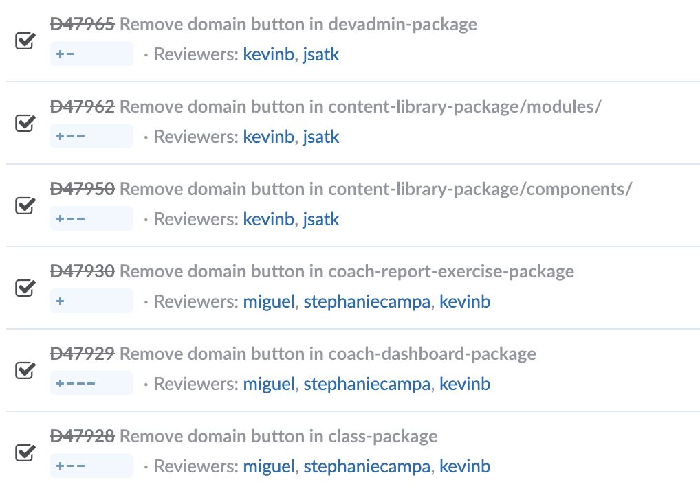
Categorize the changes by team, keep the changes very small, and deploy often
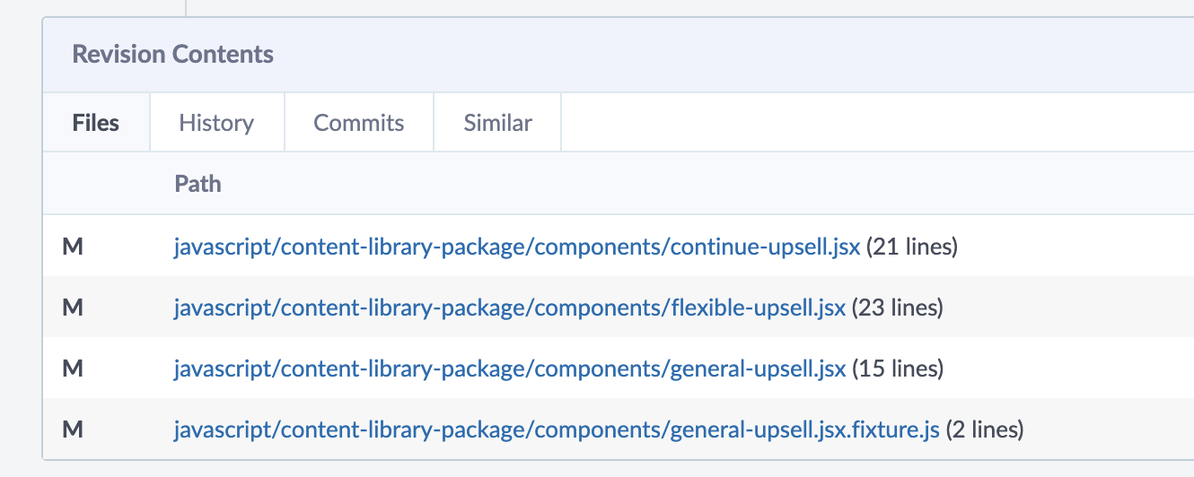
By doing this, I could reduce the chances of merge conflicts and make deployment more painless. At Khan Academy, we organize the code by packages, each of which is owned by one team. By keeping each commit within one package, I could request reviews and ask design questions from the correct team and it was straightforward to write test plans since the change only impacted one area of the site. In general, it’s easier for reviewers to provide detailed reviews when the changes are small. I tried to keep changes limited to only touching 10 files. Some might say, “ain’t nobody got time for monster diffs”.
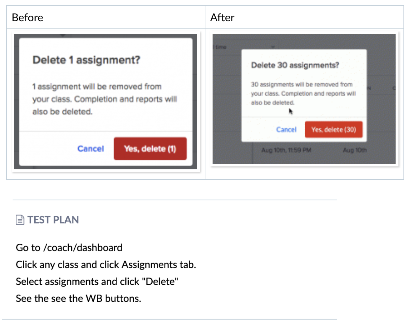
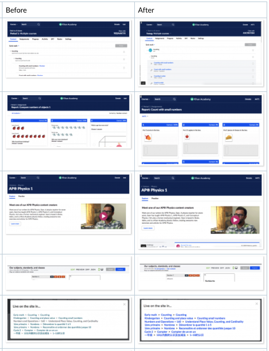
Write a detailed test plan with before and after screenshots
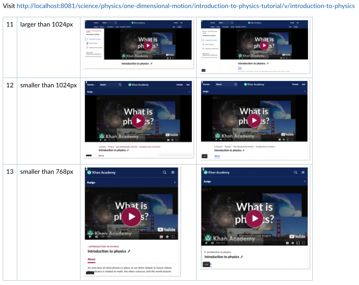
Normally we would have a mockup for a new change but for this renewal, we had to do an entire codebase sweep without new mockups. Since these changes crossed so many areas of the site, I asked each team to assign a designer and code reviewer to validate the changes. We also needed to make changes in lesser-known areas of the codebase, so I wrote test plans including steps to navigate to where the component is rendered and screenshots at various screen widths (for responsive views) to give reviewers an at-a-glance summary of the change.
In practice
Having decided upon appropriate guidelines, I started the component conversion one by one. I made a list of all the components that needed conversion, and just picked one and went for it. Since our web application has been around for a long time, there are so many product areas that I didn’t know about. Still, I needed to touch code all over the place and I didn’t want to break anything accidentally. Naturally, having a good testing strategy was very important. Depending on the parent component of the target, I did the following:
Components in commonly used parts of the site
This type of component is mostly modern and relatively easy to test. They usually are specific enough that I can figure out where they are in the application and see it rendered before and after conversion to test. I included a before and after screenshot to simplify the review process.
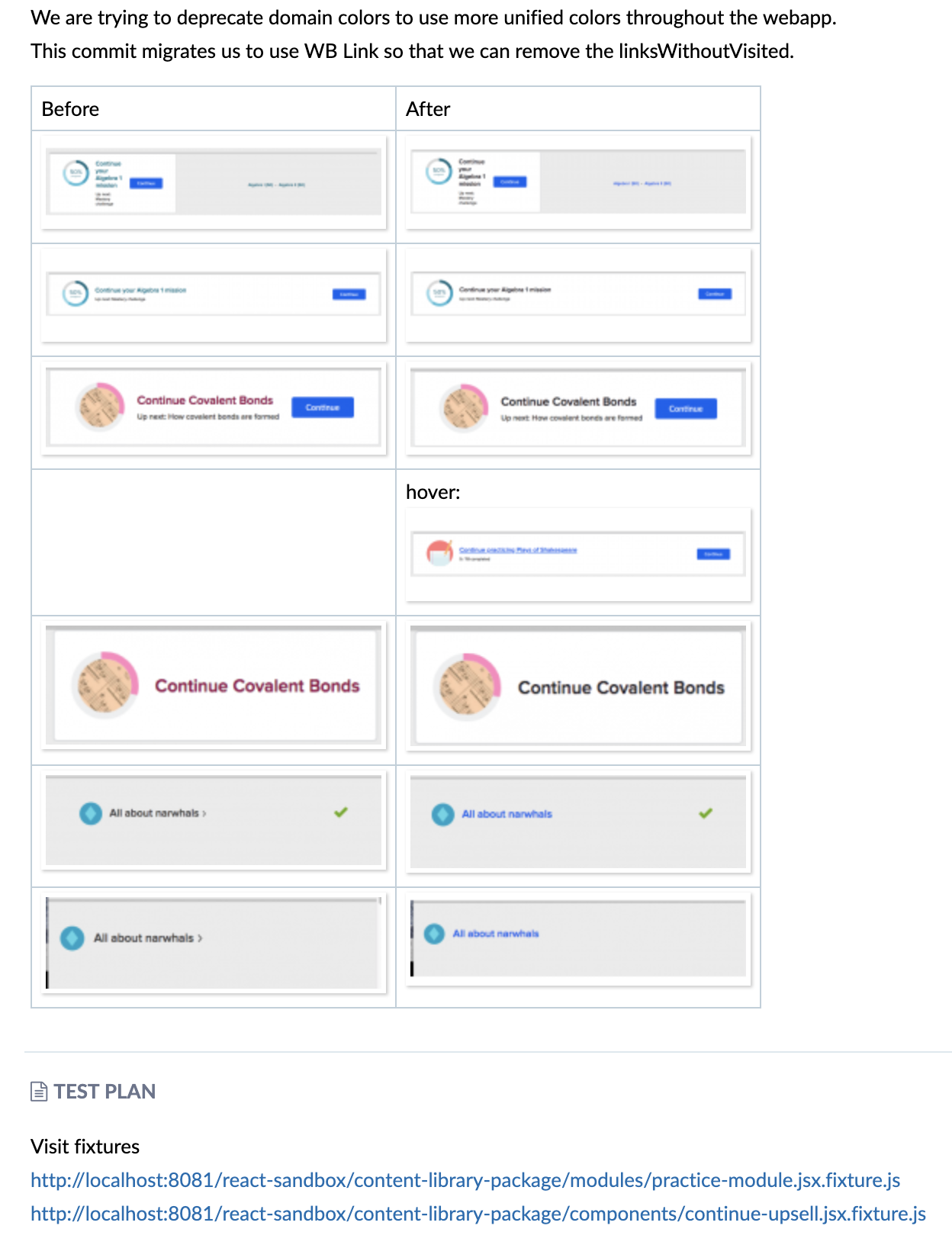
It became tricky when the component was shared across the entire app, like the Breadcrumb component, which is used frequently in different contexts. It takes more time and effort to thoroughly test each place. This called for a more detailed test plan. Even though the change was small, there were many places where this component was rendered that had to be tested. Again, screenshots helped reviewers out here.
Components in less commonly used parts of the site
As a ten-year-old site, we have some older components in our code which aren’t changed often. In some cases, I felt lucky to find anyone who knew where these were used. Some of these older components didn’t even make good use of our system of “fixture tests” which render components outside of their normal context in the site (we use a custom framework for this, but React Storybook is another popular solution). The lack of good tests for those made safely making changes more difficult.
For those unlucky cases, I wrote a temporary fixture or injected that component in a known area of my development server with fake props just to see how the component looks. I then took screenshots and removed my temporary work. This was extra difficult because many of the old components have Backbone mixed in. The following is an example of a test plan using a temporary hack in order to verify the conversion.
Test Plan:
Comment out mixins: [BackboneMixin], in
javascript/exercises-legacy-package/components/exercise-footer.jsx
Make const maybeConfetti = null in render function.
Add return "" in javascript/tasks-package/completion-criteria-formatter.js:26
Uncomment javascript/exercises-legacy-package/components/exercise-footer.jsx.fixture.js
Visit fixture http://localhost:8081/react-sandbox/exercises-legacy-package/components/exercise-footer.jsx.fixture.js
Change the props to see various buttons.
Challenges
It took me a little over a month, totalling 68 commits and touching 174 files. During this procedure, here are some things that made this task challenging:
1. Lots of infrequently touched product area
Many changes touched older code which hadn’t been updated for years and didn’t have the tests we require now. That was tough but the only thing I could do was to try my best. It really reinforced the importance of writing tests. Writing good tests ensures future engineers can modify old code comfortably even when the original authors are gone.
2. Time difference and communication
During this project, I worked from South Korea, which is 16 hours ahead of Mountain View. That made communication harder since I was asleep during normal office hours. To combat this, I wrote detailed test plans with fool-proof reproduction steps so that I could minimize the number of questions and reduce back and forth on code reviews.
3. Button and Link components can cause either client- or server-side navigation
We started converting our site to a single page app (SPA) last year. Some parts had already been converted, but others still used the old architecture. Sometimes, it wasn’t clear whether I should use client-side navigation or trigger navigation to a new page. This led to an unexpected error after deployment when one of the converted Links used client side navigation to a page that wasn’t in the SPA. This caused the page to go blank for that route, and we had to quickly change the Link to use server-side navigation (This unfortunately happened while I was sleeping – thanks to John Resig for the fix!)
Summary
Converting a variety of older, inconsistent components to a single new component takes time, effort, patience, and good tests.
Thanks
Special thanks to John Resig and Kevin Barabash who supported the decision to convert links and buttons as part of the color system rollout and all the designers and engineers who reviewed the changes.