By Shadaj Laddad
This past summer I had the amazing opportunity to work on a product I use as a student every day: Khan Academy. During my internship, I worked on the web frontend team on the amusingly-named X-on-Mobile initiative (XOM) to bring Khan Academy exercises to mobile devices. In this blog post, I’ll be going through a highly-compressed summary of my two months at Khan Academy.
Part 1: Ramping up
My first day at Khan Academy was a whirlwind of activities. From setting up my laptop to having a 1:1 with my mentor and finally adding myself to the interns page, I had a lot of things to do. As soon as I settled down with my first deploy, I got to work on the XOM initiative, starting with improving the math keypad.
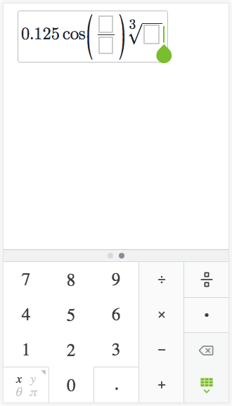
As part of XOM, the team had designed a math keypad that could be used to type in expression responses to mathematics problems in a mobile-friendly way. I started by fixing some bugs, such as disabling gestures on the keypad’s sidebar, which has navigation buttons that cannot be swiped around like the other keys. Once I had a good idea of how the keypad worked, I was able to start working on adding new features our designers had crafted such as using square icons for representing empty blocks. And, by working on these low-level details, I learned the difference between a good user experience and a great user experience: polish.
At Khan Academy, we use React, something I had worked with before, but only in the context of Scala.js applications. As part of making changes to the math keypad, I had to learn how to write idiomatic ES6 code. Working on Khan Academy gave me a great opportunity to use React with ES6 in a production environment, and left me with many ideas on how React.js could be used more seamlessly with Scala.js. For example, seeing how properties could be easily reused for different components in ES6 gave me ideas of different ways to model properties in Scala.js.
In addition to learning React and ES6, I got a chance to work with the plethora of open-source libraries at Khan Academy. For example, I often used Aphrodite to style React components, with which I learned how easy it is to use inline styles to bring your CSS styles and JavaScript code closer together.

an early screenshot of changes to the math keypad
Part 2: iframes, iframes, iframes
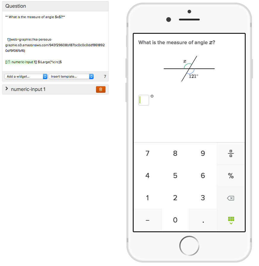
Now that I was used to the flow of picking a task, creating a code review, and deploying my changes, I started on my first project: improving our content editor to be mobile first. Historically, our content creators have worked primarily on desktop: they write their content on desktop, they preview their content on desktop, they review each other’s work on desktop, they check their email on desktop. How can we make it easy for our content creators to build content for mobile first, and thereby avoid awful small-screen layout bugs, but still allow them to take advantage of the big-screen multi-tasking perks of desktop devices? This involved pulling together specs for what types of devices students use Khan Academy on, rendering content with the new styles the rest of the team was working on, isolating the rendered content to prevent styles leaking from the rest of the editor, and implementing touch emulation for interacting with the mobile previews.
To implement the isolation of content, I decided to render previews inside of iframes. In addition to providing style isolation, iframes also made it possible to properly render components that are rendered directly to the body, such as the math keypad I worked on earlier. But to work with iframes, I now had to make sure that the iframes showed live previews while maintaining the speed of the preview updates. Having quick preview updates meant that iframe reloads had to be minimized and communication between the editor and preview frames needed to be as fast as possible.
To transfer data between the parent editor and the child iframe, the parent first stores a JS object representation of the exercise content in a global variable, because the exercise content contains callback functions which prevent it from being serialized for window messaging. The parent then sends a message (http://ejohn.org/blog/cross-window-messaging/) to the iframe, notifying it of the updated content.
When the iframe receives this message, it grabs the exercise content from the global variable from the parent and renders that content. The browser only allows this because the iframe and parent are on the same domain. With this implementation, preview updates happen immediately after content edits. In addition, iframe loads are minimized with a custom shouldComponentUpdate method that only allows full reloads for switching form factor or enabling/disabling touch emulation. In most cases, the only delay happens during the initial editor load.

live-updated interactive mobile previews with iframes!
After these changes were implemented, I got the chance to work with content creators to test out my changes and make sure they didn’t interrupt their creation process. By working with content creators, I was able to understand exactly what they were hoping to get out of my changes, and I was able to tune the goals of my project to these needs to make sure that it was helping the content creators as much as possible. For example, I learned that content creators often take screenshots of the editor for annotating content, which resulted in changes to the editor to make sure that all preview content was always visible with no scrolling. With all the kinks worked out, I was able to finally deploy the content editor that is now used by content creators every day! Even as I continued on to my next project, content creators continued to provide feedback that was worked through and helped further refine the editor.
Part 3: crispEdges for the win!
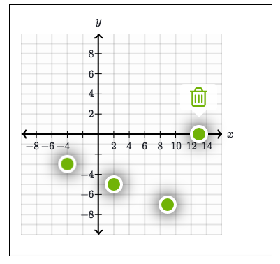
Moving on from the mobile-first content editor, I began work on my next project: making KA’s interactive graphing widgets work on mobile devices. Since new designs for the mobile widgets were needed to make graphs fit in with our visual language in other mobile experiences, I worked with Louis, a fellow intern, on the design. On Khan Academy, interactive graphs are rendered with SVGs, so most of my work dealt with rendering the SVG elements for different graph parts with the new styles.

some changes to the graph widget: larger points and deletion tooltips
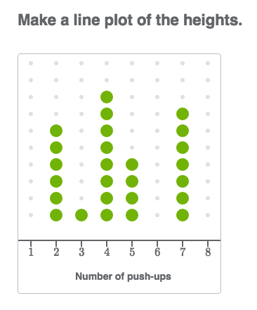
One of the most interesting things I learned in this project was the shape-rendering CSS style. On SVG elements, you can apply the shape-rendering style to give the renderer hints on what to prioritize when rendering the elements. In the case of this project, I used the shape-rendering property with the crispEdges value to make lines render more crisply. This is especially useful for grid lines, which sit perfectly horizontal and vertical. By setting crispEdges on these lines, the renderer knows to render them lined up with pixel rows instead of blurring the line to higher and lower rows. On mobile devices, especially those with higher resolutions, this small change makes a large difference in how the graphs look.

if you look closely, you can see the effects of crispEdges here
Conclusion
All in all, my internship at Khan Academy was an amazing experience. It gave me the opportunity to have an impact on learners around the world and learn many new technologies. From building new tools for content editors to creating a brand new experience for students using interactive graphs, I was able to work in a wide variety of areas. I’m super thankful to my mentor Kevin for all his help throughout my internship, the XOM team for being super encouraging on all my projects, my fellow interns for great lunchtime discussions, and the entire Khan Academy team for creating such a great place to work.
Onward!
P.S. since most of my work here was in open-source projects you can check out my work in detail on GitHub (1, 2)