By Diedra Rater
At Khan Academy, we’ve been working to make our web product more accessible to a variety of users, including those who experience blurry vision and/or severe color-blindness. Part of this work has involved updating our styling to be able to work well with Windows High Contrast Mode.
This project required a little bit of learning via trial-and-error, with a lot of help from our dear friends at Level Access, so I wanted to share some of the things we discovered to make it easier for other developers working with accessibility. In this post, you’ll learn about how to optimize web applications for the benefit of other users with visual accessibility needs.
What is it and who uses it?
Windows High Contrast Mode is an accessibility settings feature in the Windows operating system. As the name suggests, it changes the visual appearance of everything displayed to have higher contrast. This includes applications that are native to the Windows platform as well as web apps.
Khan Academy’s logged out homepage without Windows High Contrast Mode:
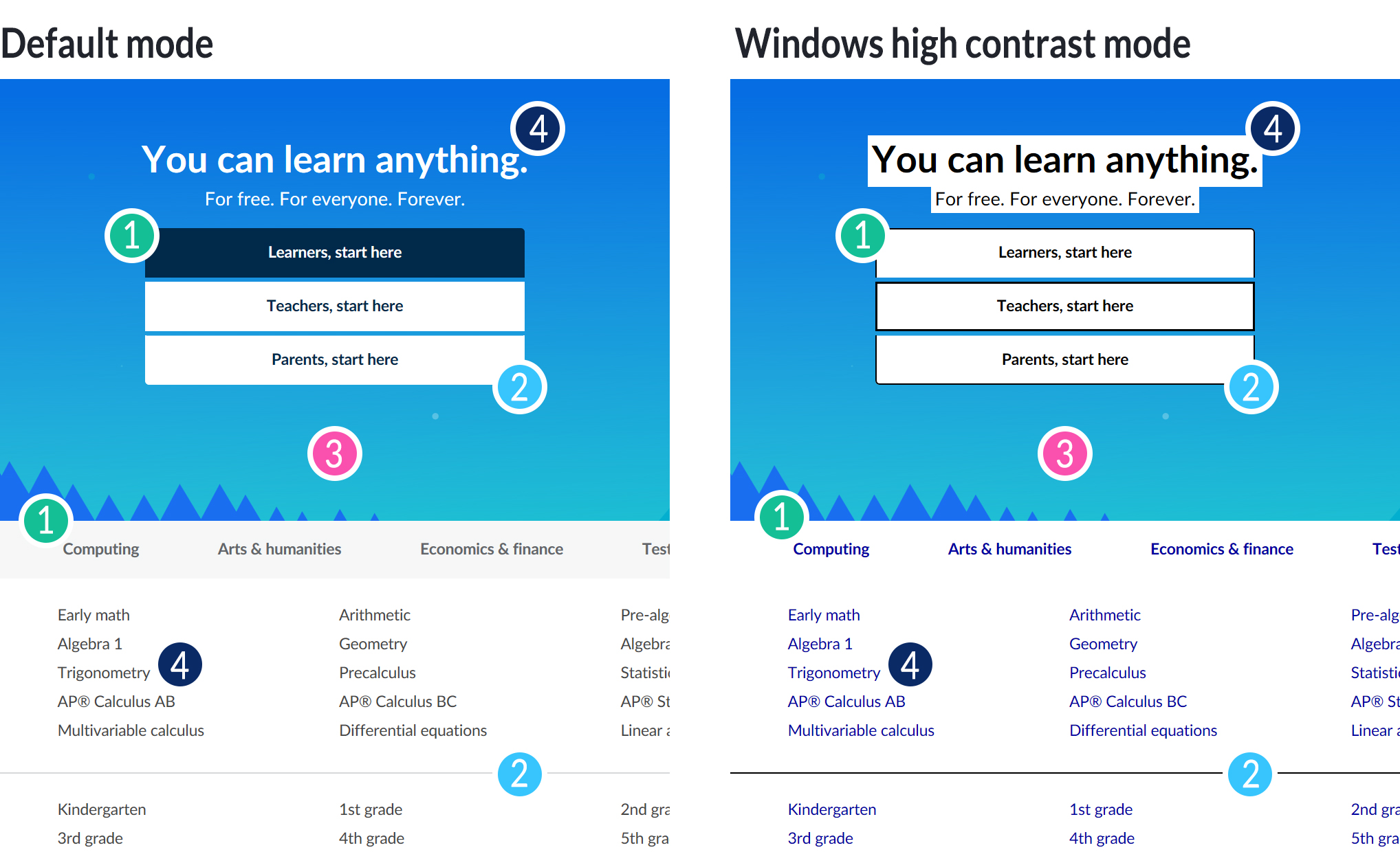
Khan Academy’s logged out homepage with Windows High Contrast Mode:
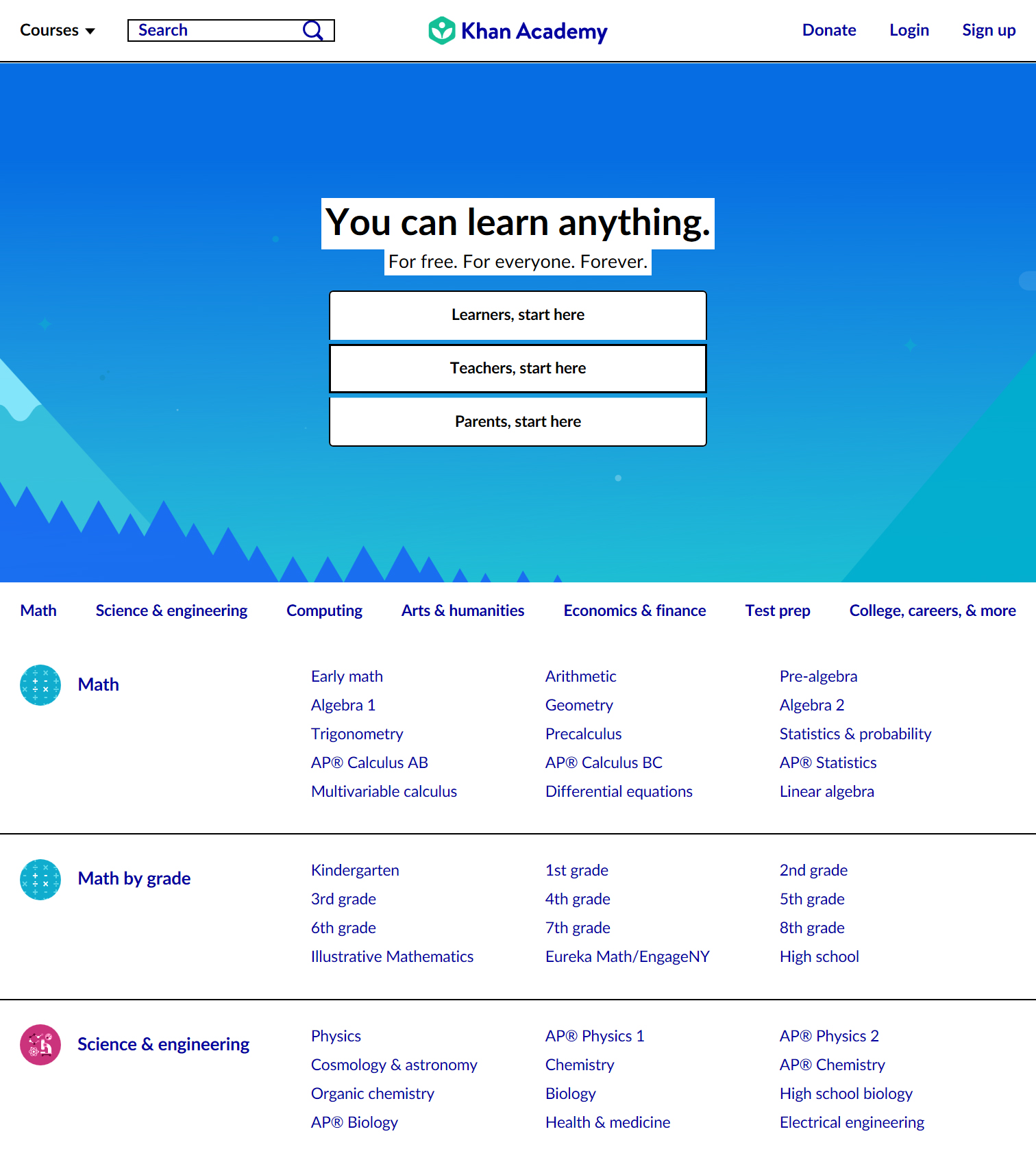
The high contrast version of the web may not be as pretty, but it is easier to see and understand.
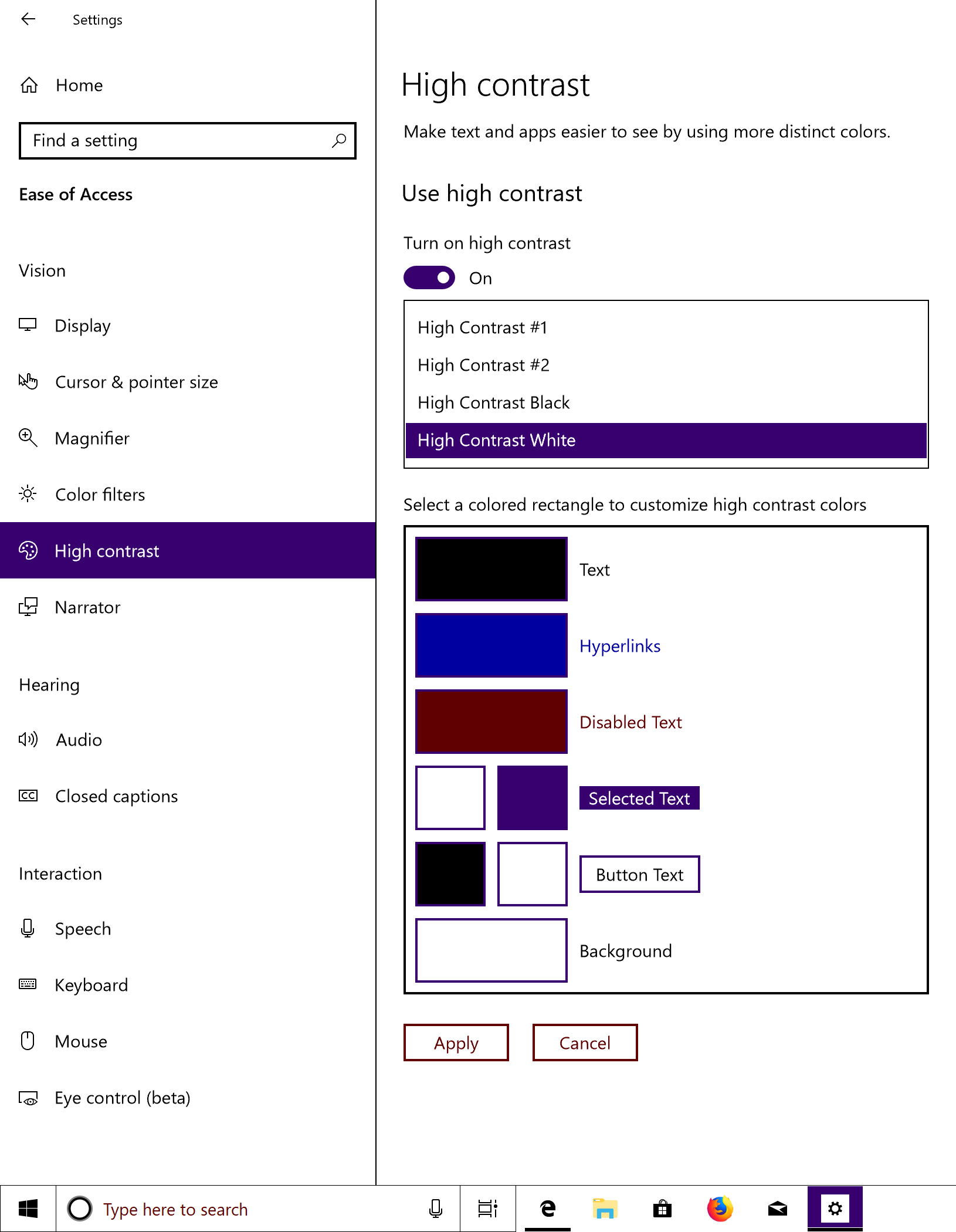
There are several different versions of Windows High Contrast Mode that can be used. The examples in this post use High Contrast White.
What does it do?
Background colors and images
Background colors and background images are removed and replaced with white.
Both of these styles would be overridden:
background-color: lawngreen; /* No color for you. */
background-image: url("cousin_fal.gif"); /* No image either. */
(You can see an example of this in #1 of the Comparison section below.)
The opacity of background color styles will remain the same, though. The color will just be changed to white.
In this code example, the background is set to 50% black. In Windows High Contrast Mode, it will instead be 50% white.
background-color: rgba(0, 0, 0, 0.5); /* White as the driven snow if the driven show were 50% opacity. */
Key takeaway
Only use background-color and background-image CSS for decorative styling. Windows High Contrast Mode considers them unnecessary to understand the page.
Border and outline colors
For border colors and outline colors, it actually goes the other way. No matter what color or opacity you set, they’ll be set to 100% black in Windows High Contrast Mode.
outline: 2px dotted lightsalmon; /* Black as your heart. */
border: 2px solid lavenderblush; /* And my coffee. */
(You can see an example of this in #2 of the Comparison section below.)
Key takeaway
Borders and outlines should be functional, not ornamental, because Windows High Contrast Mode retains them. Also, they won’t be distinguishable if used to separate black sections created by <img> and SVG elements.
<img> and SVG elements
<img> and SVG elements are immune and will remain intact.
<img src="cousin_fal.gif" alt="Cousin Fal's at it again"> <!-- Impervious to Windows High Contrast Mode. -->
<svg> ... </svg> <!-- An svg of me being too lazy to write an svg example. 1,000,000 defense against Windows High Contrast Mode. -->
(You can see an example of this in #3 of the Comparison section below.)
Key takeaway
Semantic <img> and SVG elements are for important, functional elements. Windows High Contrast Mode assumes they’re required to interpret the page.
Font colors
Font colors work the same as border and outline colors but with one more detail — the text element’s background will be set to white. This is because the <img> and SVG elements are unchanged. If you have text on top of an <img> or SVG element, the text could become impossible to see if the image were dark when the text becomes black. By forcing the text to be black and have a white background, Windows High Contrast Mode ensures that the user will be able to read the text regardless of what <img> or SVG you may have behind it.
In this example, the text will be black with a white background.
color: lemonchiffon;
(You can see an example of this in #4 of the Comparison section below.)
Key takeaway
You don’t need to worry about text color; it can handle itself.
Comparison
Here’s a section of the screenshots of the Khan Academy logged out homepage. Here we can see examples of almost all the ways Windows High Contrast Mode alters our custom styling:
- The background color of the dark blue button and the light gray horizontal list of domains below the image are now white.
- The borders on all three buttons are now black.
- The image of the sky remains intact because it’s been added as an SVG element.
- All the text on the page has returned to its default browser color (black for non-links and blue for links), and the text on top of the SVG image has a white background.
Improve web applications in Windows High Contrast Mode — practical examples from our work
Quick note..
I wanted to mention up-front that there is a -ms-high-contrast CSS media feature that allows you to detect if the page is being viewed in Windows High Contrast Mode. However, it is non-standard and unreliable; therefore, none of the examples shown here utilize this feature.
Background colors and images
Use HTML <img>s and SVG’s instead of background-color and background-image CSS for important elements in the design. Windows High Contrast Mode removes these characteristics of the page for a reason, so I don’t want to encourage you to override that override altogether. But sometimes there are elements on the page that are visually necessary for users to understand the user interface and interact with it accordingly.
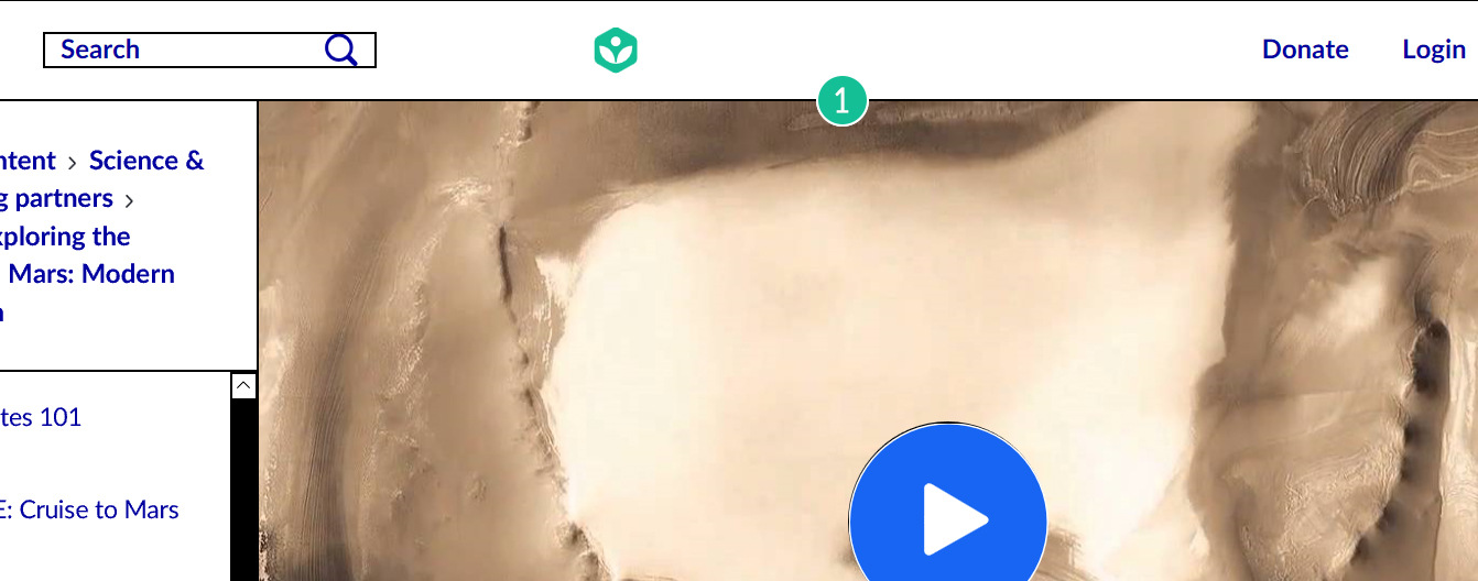
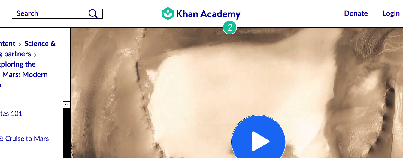
Replacing CSS background-image with an <img> element
Khan Academy video pages enable people to discuss the video, including links to specific points in the video in their comments. We visually communicate that the button jumps to a specific time in the video with a little blue play image to the left of the timestamp. This image was originally added using CSS’s background-image. Of course, it was being removed in Windows High Contrast Mode and a big empty space was left instead.
To fix this, we removed the background-image from the CSS and added the image back with a img element so it would appear in both default and Windows High Contrast Modes.
Before
Screenshot:
.videoPlayButton {
    background: url('/images/play.png') no-repeat left;
    padding-left: 18px;
    background-size: 14px 14px;

    /* Non-relevant styling has been removed for simplicity. */
}
// This is the same in both versions.
const timestamp = "3:14"; // Just for an example, to simplify this code.
const timestampAria = `${timestamp} Click to jump to ${timestamp} in video`;

return (
    <button className='videoPlayButton' aria-label={timestampAria}>
        {timestamp}
    </button>
);
After
Screenshot:
.videoPlayButton {
    /* Non-relevant styling has been removed for simplicity. */
}
.videoPlayIcon {
    height: 14px;
    width: 14px;
    margin-top: -4px;
    vertical-align: middle;
}
// This is the same in both versions.
const timestamp = "3:14"; // Just for an example, to simplify this code.
const timestampAria = `${timestamp} Click to jump to ${timestamp} in video`;

const playIcon = `<img src="/images/play.png" className="youTubePlayIcon" />`;

return (
    <button className='videoPlayButton' aria-label={timestampAria}>
        {playIcon} {timestamp}
    </button>
);
Replacing CSS background-color with an SVG element
Above the discussions feature on video pages, the video itself has a large play button on top. The actual play icon is an SVG HTML element, but it’s white, and the color for the area around it was added using background-color CSS. Of course, in Windows High Contrast Mode, the background-color CSS was removed and replaced with white, which left users with a white icon on a white background. Oops!
There are a couple of different ways to fix this, but, in this case, we chose to replace the element behind the icon with another SVG, which would retain its color. (Another option would be to allow the color of the SVG element to be overridden, which is illustrated in the next example.)
Before
Screenshot:
.playButton {
    background-color: #1865f2;
    width: 121px;
    height: 121px;

    /* Non-relevant styling has been removed for simplicity. */
}
// This is the same in both examples.
const playIcon = `M1.6,9.9C1.5,10,1.3,10,1.2,10C1.1,10,1,10,0.9,9.9C0.7,9.8,0.6,9.6,
    0.6,9.4V0.6c0-0.2,0.2-0.4,0.4-0.5C1.1,0,1.4,0,1.6,0.1l7.6,4.5c0.2,0.1,
    0.3,0.3,0.3,0.5c0,0.2-0.1,0.4-0.3,0.5L1.6,9.9z`;

const PLAY_BUTTON_DIAMETER = 44;

<button
    aria-label="Play video"
    className="playButton"
    onClick={this.handlePlayButtonClick}
>
    <svg
        height={PLAY_BUTTON_DIAMETER}
        width={PLAY_BUTTON_DIAMETER}
    >
        <path
            d={playIcon}
            fill={Color.white}
            transform="scale(4.375, 4.375) translate(9.75, 8.25)"
        />
    </svg>
</button>
After
Screenshot:

.playButton {
    /* Non-relevant styling has been removed for simplicity. */
}
// This is the same in both examples.
const playIcon = `M1.6,9.9C1.5,10,1.3,10,1.2,10C1.1,10,1,10,0.9,9.9C0.7,9.8,0.6,9.6,
    0.6,9.4V0.6c0-0.2,0.2-0.4,0.4-0.5C1.1,0,1.4,0,1.6,0.1l7.6,4.5c0.2,0.1,
    0.3,0.3,0.3,0.5c0,0.2-0.1,0.4-0.3,0.5L1.6,9.9z`;

const PLAY_BUTTON_DIAMETER = 121;
const PLAY_BUTTON_RADIUS = Math.floor(PLAY_BUTTON_DIAMETER / 2);

<button
    aria-label="Play video"
    className="playButton"
    onClick={this.handlePlayButtonClick}
>
    <svg
        height={PLAY_BUTTON_DIAMETER}
        width={PLAY_BUTTON_DIAMETER}
    >
        <circle
            cx={PLAY_BUTTON_RADIUS}
            cy={PLAY_BUTTON_RADIUS}
            r={PLAY_BUTTON_RADIUS}
            stroke="#fff"
            strokeWidth="1"
            fill="#1865f2"
        />
        <path d={playIcon} fill="#fff" />
    </svg>
</button>
Add CSS background-color via a pseudo-element
You can also force the background-color CSS to remain by adding it to a pseudo-element. This isn’t a tactic that we happened to use, but it is available if necessary.
.element:after {
  content:"";
  background-color: someothercsscolornameyoudidntknowexisted;
}
Allowing the SVG color to be overridden using fillColor
The colors of SVG’s will remain intact in Windows High Contrast Mode, but only if the colors are set directly on fill. If the svg image is white in your design, you should avoid setting that white color using fill: yourColor. Instead set fill to currentColor and set the color on a wrapper element. Then, in Windows High Contrast Mode, the color will be set to black and the svg will adjust accordingly.
Here’s an example of one place where we fixed this — the logo in the global header on Khan Academy.
Before
Screenshot:
CSS:
.logoSvg {
    fill: #fff;
}
JSX:
return (
    <a aria-label="Khan Academy" href="/">
        <svg className="logoSvg" aria-hidden={true}>...</svg>
    </a>
);
After
Screenshot:
CSS:
.logoLink {
    fill: #fff;
}
.logoSvg {
    fill: currentColor;
}
JSX:
return (
    <a className="logoLink" aria-label="Khan Academy" href="/">
        <svg className="logoSvg" aria-hidden={true}>...</svg>
    </a>
);
Border and outline colors
Use invisible borders and outlines to visually define edges of elements that are created through different background colors laid against each other. Since borders and outlines are automatically set to 100% opacity black, you can make them 0% opacity in default mode so they will only appear in Windows High Contrast Mode. Borders can have rounded edges and be restricted to specific sides, but they increase the size of the element. To avoid affecting the design in default mode, if you’re retrofitting an existing design, you might want to use an outline.
This is something we encountered with our sign up/login modals, which are visually defined based on their light background colors against the dark partially-transparent backdrop.
(Side-note: Here you can see an example of a partially-transparent background color being set to white but with the same opacity as in the original CSS.)
Before
Screenshot:
After
Screenshot:
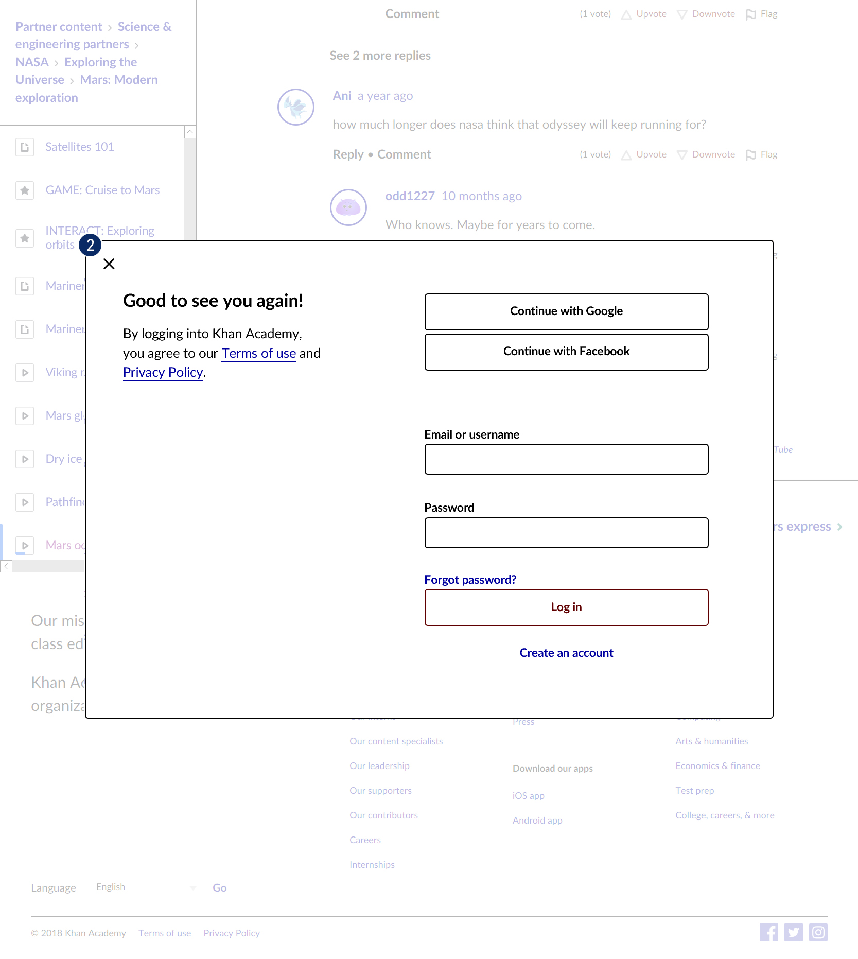
CSS:
.modal {
    border: 1px solid rgba(0,0,0,0);
}
Summary
In the end, the best approach to accessibility that I’ve found is to follow the web development standards when possible.
- Use semantic HTML for elements and CSS for styling. If an image is decorative, use
background-imageCSS. If an image is imperative for all users to see, use an<img>or SVG element (with appropriatealttext). If the element links to something, use an<a>element. Following these standardized patterns will get you most of the way for Windows High Contrast Mode (as well as screen readers and keyboard navigation too).
- Be careful when overriding default styling. When you override the default styling for an element (for example the focus outline, text decoration, or border on interactive elements), it has an effect that may be invisible to you based on your specific testing environment. Consider making the style invisible using 0% opacity color instead of removing it altogether.
Questions / comments / sweet memes?
You can reach out to us on Twitter or send us a support ticket!
Thank you for reading this post (or at least scrolling to the end)! I hope that it’s been educational to you in some way and helps in your journey to make the web a better place.
Onward!