
By Caitlyn Mayers, Staff Product Designer, Accessibility & Design Systems
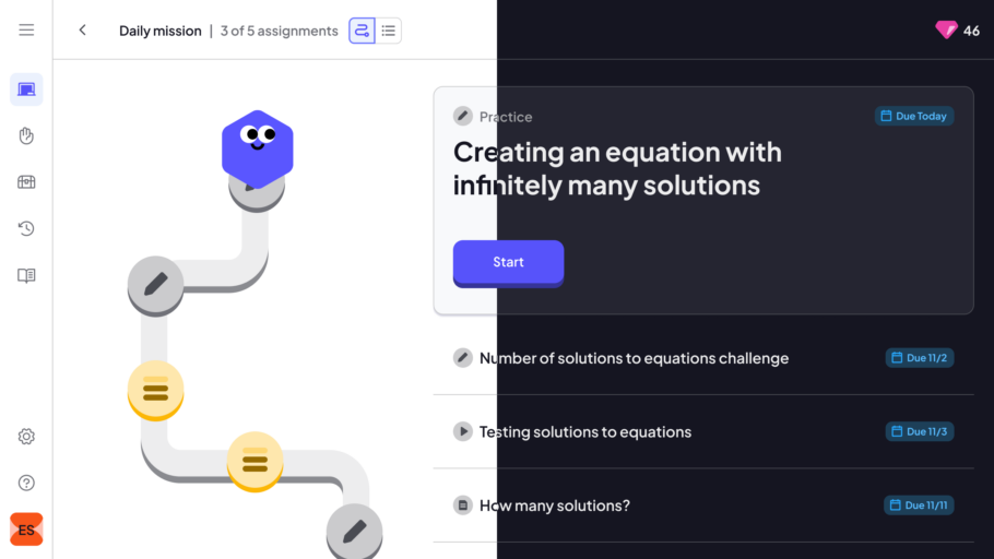
In 2025, we reimagined Khan Academy for our district partners, rebuilding it to better serve every kind of learner in every kind of classroom in order to ensure every student has the opportunity to master grade-level material. This reimagination included a completely new user interface that is visually distinct from previous Khan Academy experiences.

The brand-new interface required a refresh of our Wonder Blocks design system’s code components and Figma libraries, as well as changes to its foundational settings, including color, typography, sizing, and spacing. In this post, we’re going to take a deep dive into the creation and architecture of our new color system.
Previous Palette
Our previous color palette contained a limited set of primitives and semantic tokens, with solid versions of every color and alpha versions of specific color sets. This had a few gaps that created some use problems across our teams.
Despite having the specific semantic categories needed for color use across our products, the previous color system was fairly rigid and narrow. Teams often used the wrong semantic tokens to achieve a specific visual presentation that the system’s semantic structure wasn’t designed to support (e.g., using an Icon color for text or vice versa). This led to incorrect token use across the product.
Because we had alpha versions of some but not all colors, it was not always clear when teams should use solid versions of colors vs. the alpha versions of colors. Incorrectly-used alpha tokens resulted in insufficient contrast.
When we needed a new color somewhere (e.g., we needed darker hues in a few places to address contrast failures), we had to start the color process over from scratch to create the new color and did not have a complete primitives palette from which we could pull an existing hue and apply.
Starting from first principles: Building a new palette
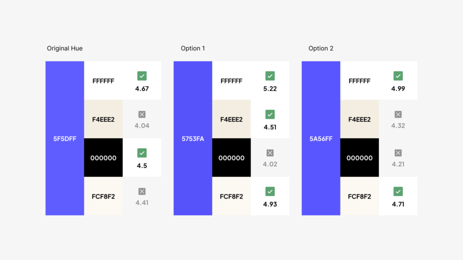
In the process of redesigning the interface, we threw out all of our priors in order to create the new color system. Staff Visual Designer Camilla Hernandez began early brand explorations of three divergent interface presentations. Each one used a narrow and distinct palette of core hues.
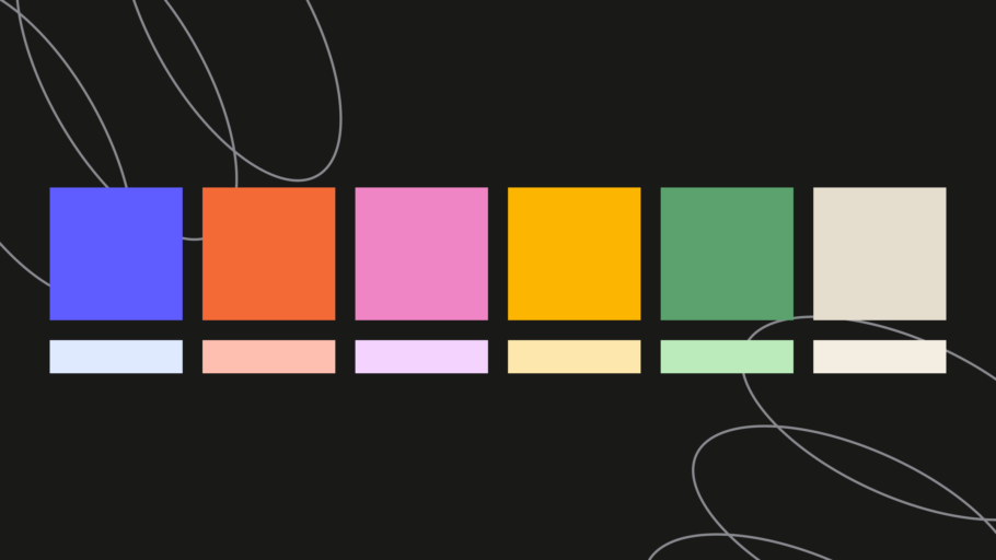
Those core hues were immediately tested for contrast against solid white, black, and typical muted-surface colors. A few of the colors did not meet the 4.5:1 contrast ratio required for normal text, so we made some slight tweaks to those colors in order to avoid having to rework major portions of the color palettes after they had been defined.
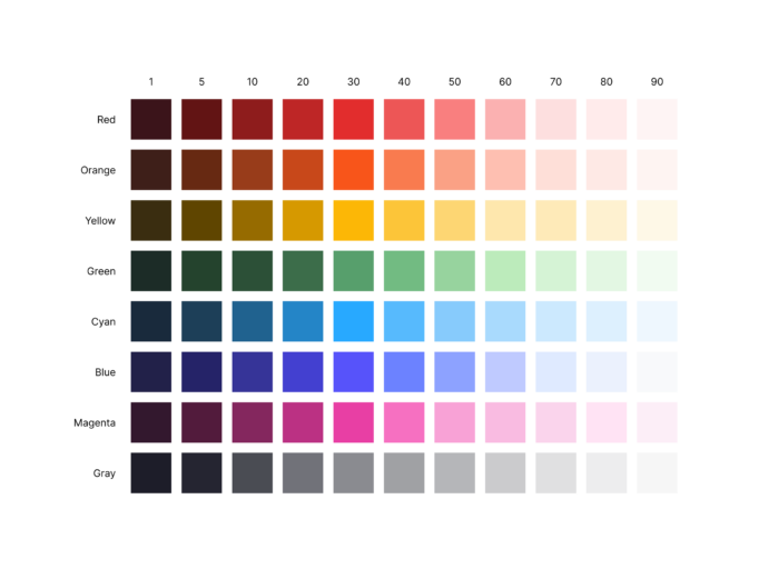
Once aligned on the core swatches for our palette, we built a full primitives palette that included all possible hues in our system’s color spectrum so we could pull from existing hues when we needed to expand our color use in the future.
Hues in the new primitives palette are organized numerically following the lightness scale in the HSL space: 0 is the darkest shade of a hue; 100 is the lightest shade of a hue.
After completing the primitives palette, we updated the existing semantic tokens to reference the new primitives and began designing the new UI. The design team explored the new UI designs using both the primitives and semantics to shape color in the experience, but we quickly felt constrained by the old semantic schema. We needed a wider variety of semantic hues to support the ways in which we were working with color in the new UI.
Within a design system, semantic tokens serve as an important abstraction layer that allows us to organize colors by concept, specifically communicating the purpose they serve within the system and our interfaces. This abstraction helps teams understand how a color can be used and shows them where to correctly apply it to the interface in a consistent manner.
Figuring out how we could change our semantics to be more expansive while still preserving the integrity of the schema and value of semantic color tokens was a real struggle, and the pieces did not easily fit together in the previous architecture.
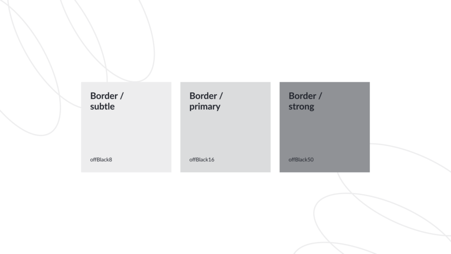
The design system team (one designer and three engineers) discussed this struggle. One of our engineers, Juan Andrade, pointed out that we had a potential scaffolding pattern in the border colors and suggested that we might be able to extend that across other tokens. The border tokens had three values of varying intensity: Primary, Subtle, and Strong.
This pattern unlocked the entire token schema for us. We took this core concept, which we now call our Intensity Scale, and crafted a new token architecture around it.
A new semantic color architecture
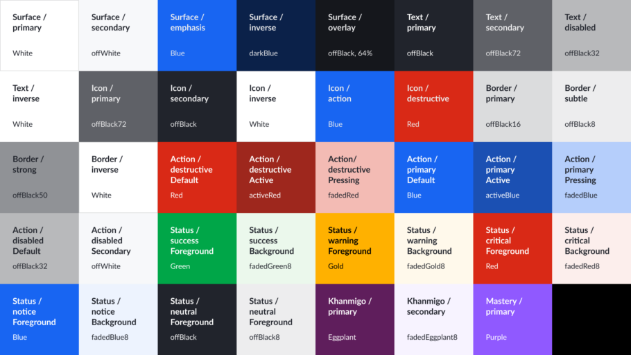
Within the semantic palette, tokens are organized using the following schema:
Domain
- Layer
- Context
- Intensity
- Context
Domain
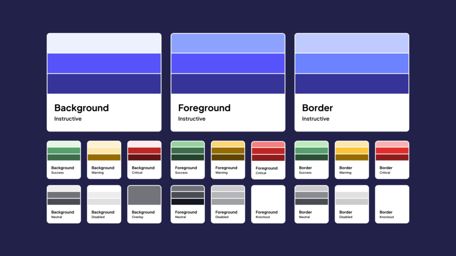
A domain represents the scope, role, or application of a collection of tokens within the system. Wonder Blocks color tokens have three domains: Core, Learning, and Component.
Layer
Tokens within a domain are organized by role. Each represents different layers of the UI.
- Background
- Border
- Foreground
- Shadow
Background
Background tokens style the fill color of a component or element’s container.
Border
Border tokens style defining borders around or separators between elements.
Foreground
Foreground tokens style text or icon elements that sit on top of the background of a component or view.
Shadow
Shadow tokens add depth and elevation to a component or element in a design.
Context
Within each layer, tokens are organized by context, the expected application or purpose of the hue.
Core Contexts
- Base
- Instructive
- Neutral
- Disabled
- Success
- Warning
- Critical
- Knockout
- Overlay
The Intensity Scale: Subtle, Default, Strong
The intensity scale provides three values available to use within each Context. The intensity is determined by the amount of contrast and visual weight a given value has relative to the Core Base Default token, which serves as the anchor color from which the Subtle and Strong values are determined. Subtle intensity has lowest contrast and Strong intensity has the highest contrast against the anchor color.
Example
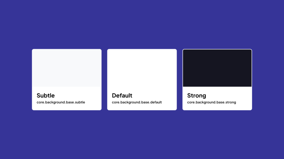
Domain: Core
- Layer: Background
- Context: Instructive
- Intensity: Subtle
- Intensity: Default
- Intensity: Strong
- Context: Instructive
Now that we’ve outlined the schema for our semantic tokens, let’s take a deeper look at how these concepts work in practice across the Core Tokens domain.
Putting the schema into practice
Core tokens are intended to power a majority of the components in the Khan Academy experience. These tokens are largely scoped to the system’s functions, rules, and opinions.
Layers
Core Tokens have four layer categories:
- Background
- Border
- Foreground
- Shadow
Contexts
Core Token Layers share the following nine contexts:
Base
Base tokens are available only as Background tokens. Base tokens style a majority of the background colors across the Khan Academy experience. The Default Base token is the anchor token used to calculate the intensity of the other tokens in the system.
Instructive
Instructive tokens style elements that serve as main elements and actions within a view. Instructive tokens guide users to the most-intended actions in a view, typically actions that advance the user to another step in the flow, complete a progressive (non-destructive) action, or communicate general interactivity.
Neutral
Neutral tokens style elements without conveying additional meaning through the visual presentation. Neutral tokens help preserve hierarchy balance when multiple elements with differing visual weights are present in a view.
Disabled
Disabled tokens style elements that users are actively prevented from interacting with using a disabled state in code. Disabled tokens have low contrast and visual weight so that a user knows that a control is not an active, interactable control.
Success
Success tokens style elements that confirm that an action or objective is successfully completed.
Warning
Warning tokens style elements that show non-urgent information that could require intervention. Warning tokens also style elements that are in -progress, incomplete, or pending.
Critical
Critical tokens style elements that require immediate attention, as well as actions that are considered destructive within the experience. Critical tokens imply that an element or action is blocked or they have an error that needs to be fixed.
Knockout
Knockout tokens, available for Border and Foreground categories, style elements that need a strong visual separation or contrast from other surrounding colors (typically darker values).
Overlay
Overlay tokens are transparent, background-only tokens that style the full-page background that separates or masks an overlay UI component, such as a modal, from the main UI elements underneath it.
Rethinking semantics: instructive and knockout
There are two contexts created in this schema that were departures from the first semantic schema—our Instructive and Knockout contexts. In the first schema, Inverse tokens were used inconsistently to try to support dark sections of the legacy interface. The final presentation of an inverse token varied depending on the context of the use. An inverse background could be dark but the inverse foreground color would be light. This inconsistency between when inverse meant light and when it meant dark was frustrating. So we eliminated this category across our tokens in favor of using the Strong background tokens and a Knockout token category for any foreground colors on Strong or Default backgrounds.
Our Knockout tokens borrow their purpose from the knockout printing technique—knocking out the background color of an element so the foreground contents are visible with sufficient contrast. Knockout is a more agnostic term, allowing its color value to be light or dark relative to the design of other elements in close proximity to the element using the knockout token.
Another change to our contexts is the addition of the instructive category. In most design systems, what we call Instructive tokens are referenced as Brand or Primary tokens. Given how we use these tokens and the context of our platform, Instructive felt like it captured and represented the function of these tokens in our system more intentionally than Brand or Primary.
Designing for accessibility and contrast
We stress-tested the semantic palette and calculated contrast ratios for all core tokens in the system to ensure that the palette serves a wide range of users and meets accessibility standards. The following guidance outlines the combinations that meet these benchmarks, helping teams understand how to work with color in the system and use accessible combinations across the layers and elements being designed and built.
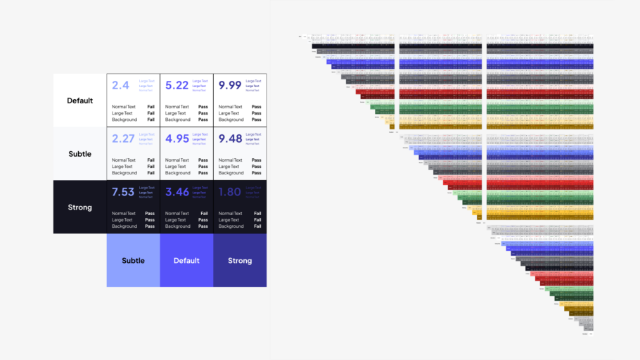
Backgrounds
- Default and Strong Background tokens (minus Warning) pass at 3:1+ on the Default and Subtle Base Background tokens
- Strong Background tokens pass at 3:1+ on all Subtle Background tokens
Borders
- Strong Border tokens pass at 3:1+ on all Subtle Background tokens and the Default Base Background token
- Default and Subtle Border tokens (minus Warning) pass at 3:1+ on all Subtle Background tokens and the Default Base Background token
Foreground
- Strong Foreground tokens pass at 4.5:1+ on all Subtle and Base Background tokens
- Default Foreground tokens pass at 4.5:1 on Default and Subtle Base Background tokens and most Subtle Background tokens (with a few 3:1 only passing exception
Supporting multiple themes without breaking the system
Our system uses themes to change the visual presentation of the components, so the same components can be used in both the legacy and new Districts experiences and align to the UI paradigm of each theme. To accomplish this, we mapped our old primitive color values to the new semantic schema. The old design language does not perfectly map to our new design language, and we had to decide how to approach resolving these conflicts. The design system team chose to optimize the system for the best presentation in the new theme, even when that would result in a less-than-ideal design in the old theme, so the design of some legacy components changed as a result of the schema alignment.
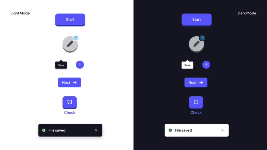
Dark mode
Our team is currently in the process of expanding our UI themes and adding dark modes to them. The new schema and variable setup in Figma allowed us to create and deploy our first iteration of true dark mode in a matter of days.
We expanded the primitives by adding another stop in the ramps for darker background hues that allowed us to achieve a look and feel in dark mode that had parity with that of the light mode. We also made minor adjustments to a small number of primitive hues to meet contrast requirements on the dark backgrounds. Lastly, we modified some semantic surface-color choices across components, like our modal, so the designs maintain identical hierarchies in both light and dark modes.
There were some constructs in the schema that didn’t hold up as well in dark mode because of the contrast choices we made with the Instructive hue, opting for higher contrast in that hue against light colors vs. darker colors. Instead of inverting the Knockout color in dark mode, we maintain the maximum lightness hue here so we can continue to meet contrast requirements (you can see this in the Knockout token example image in the previous section).
A more flexible, accessible future for color
We are absolutely thrilled with this new token architecture. It’s not easy to introduce a brand-new, unifying token schema when you have two color systems to merge. But we are so proud of how this work turned out.
This new system gives us a wider range of semantics to use in our UI, provides more specific guidance as to how each color should be used within a given design, and is fully stress-tested for accessibility requirements.
If you’d like to give this schema a spin, we built a small generator tool with Claude that builds a full primitives palette and semantic tokens based on this schema. This tool allows you to:
- Customize primitive values
- Select your primary anchor (brand) color
- Set the color values assigned to Success, Warning, and Critical contexts
- Download palette as CSV
- Export palette as JSON for Figma Variables
If you or your teams decide to apply this schema to your systems (especially new ones!), let us know how it works for you. Design-systems work is better when it’s done out in the open, and we’d love to see what you do with the framework.