Khan Academy has come a long way from when I first joined waaaaay back in 2010. The company and product have both matured. The content and experience that we offer the world has grown and changed dramatically, but this is the slow steady change of iterative improvement. And even though we’ve added over 1,000 videos and hundreds of interactive exercises to the site, that change isn’t always obvious.
It’s going to be hard to miss the changes we’re releasing today.
Current: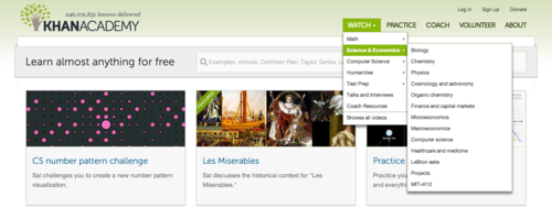
New: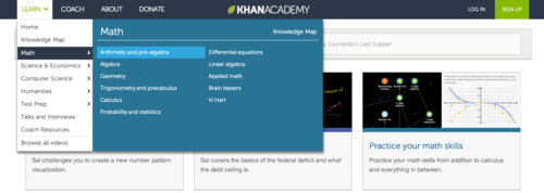
Today, we’re launching the first piece of what will eventually be a major redesign of Khan Academy. This first step is part visual refresh, part re-focusing of the interface that folks use every day, and part foundation for future changes. This change should help to clarify exactly how our content is organized and what order we recommend proceeding through tutorials while fixing a host of other small bugs (like progress indicators not showing up or not being properly aligned). It also includes user experience improvements like the menu improvement that Ben Kamens blogged about.
For the curious, we’re planning a more in-depth look at the ideas and process behind these changes to be written by our amazing design intern, Tabitha Yong. Keep an eye out here for an announcement when that’s ready.
We’ve been testing these changes with a subset of our students and teachers around the world for the last month or so, and lots of folks have reached out to us, excited about the changes. But change isn’t automatically good and it’s definitely not always easy to deal with. We know folks will have questions and concerns. I invite you to leave your comments and questions here, or get in touch with the team via Twitter, and DEFINITELY file bug reports for things that are getting in your way. Your feedback is critical to helping us understand how to improve. Please don’t be discouraged if we can’t respond to you individually! We are reading/listening.
Love,
Team Athena (Ben Komalo, Marcia, Marcos, Jason, Tabitha)